

Think before you print!
Thursday, October 25, 2007
Imagine the scene... You click, click, click with your digital camera, snapping photo after photo till you're satisfied you got a perfect shot (or two!). You go to download your photo's to the computer, adjusting the quality as need and then print. WAIT! STOP and THINK! It doesn't have to end there! You can do so much more! And this month I'm going to show you how!
If you're anything like me you have a vision of what the layout is going to look like as soon as you see the photo on your screen. Not ALL the details are planned out but I have an idea of colors, and theme I'm going to use. So why not take things one step further before you print those photo's! There are TONS of options out there in the digital world to jazz up those photo's adding a little pizazz to your page! In the example below I added a digital frame and some text. I enlarged the photo so it also serves as the title to my page!
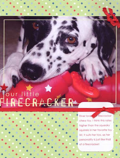
patterned paper: Boxer Scrapbooks Productions, Digital Frame: Suzanne Walker at www.digitalscrapbookplace.com, Ribbon: Boxer Scrapbooks Productions, Eyelets: Boxer Scrapbooks Productions, Font: Century Gothic, Other: Star Brad
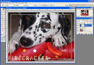
For this example layout I first opened my photo, adjusted the levels and curves and sharpened the image. This left me with the basic photo, just of a higher print quality
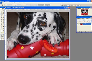
I opened the frame and dragged it on top of my photo, and resized the frame to fit the image. The frame I chose comes with text as part of the image, this makes a perfect title, or subtitle. As you can see the original frame is black, which makes it difficult to see on a black and white subject.
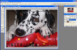
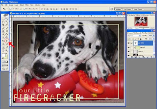
Therefore I decided to recolor the frame. I did this by opening a new layer, and filling the layer with the color of my choice. I decided on a celery green to match the patterned paper I was using.
I then clipped the frame and fill layer together using the shortcut “Control G” creating the frame in the celery green color.
Only one more step remained, and that was to add the text “Our little” to complete my title. I chose the same font I would be using for the journaling (Century Gothic) and the same celery green color. Once I was happy with the placement I printed it at home, as a borderless 8.5” width photo. This left the frame text large enough to use as my title!
Of course you can either print at home or send the photo's to be printed, making sure you have the photographs at the correct size for processing.
So next time you're sitting at your computer altering photo's for quality, go that extra step! Add some digital frames, title, journaling or word-art to your photographs! You'll be amazed how taking that one extra step really makes your pages POP!
If you're anything like me you have a vision of what the layout is going to look like as soon as you see the photo on your screen. Not ALL the details are planned out but I have an idea of colors, and theme I'm going to use. So why not take things one step further before you print those photo's! There are TONS of options out there in the digital world to jazz up those photo's adding a little pizazz to your page! In the example below I added a digital frame and some text. I enlarged the photo so it also serves as the title to my page!

patterned paper: Boxer Scrapbooks Productions, Digital Frame: Suzanne Walker at www.digitalscrapbookplace.com, Ribbon: Boxer Scrapbooks Productions, Eyelets: Boxer Scrapbooks Productions, Font: Century Gothic, Other: Star Brad
For this example layout I first opened my photo, adjusted the levels and curves and sharpened the image. This left me with the basic photo, just of a higher print quality

I opened the frame and dragged it on top of my photo, and resized the frame to fit the image. The frame I chose comes with text as part of the image, this makes a perfect title, or subtitle. As you can see the original frame is black, which makes it difficult to see on a black and white subject.

Therefore I decided to recolor the frame. I did this by opening a new layer, and filling the layer with the color of my choice. I decided on a celery green to match the patterned paper I was using.

I then clipped the frame and fill layer together using the shortcut “Control G” creating the frame in the celery green color.

Only one more step remained, and that was to add the text “Our little” to complete my title. I chose the same font I would be using for the journaling (Century Gothic) and the same celery green color. Once I was happy with the placement I printed it at home, as a borderless 8.5” width photo. This left the frame text large enough to use as my title!

Of course you can either print at home or send the photo's to be printed, making sure you have the photographs at the correct size for processing.
So next time you're sitting at your computer altering photo's for quality, go that extra step! Add some digital frames, title, journaling or word-art to your photographs! You'll be amazed how taking that one extra step really makes your pages POP!
Published in July 2007 Scrapstreet Ezine
all text and images copyright Di Hickman
all text and images copyright Di Hickman


3 comments:
SOOOOOOOO CUTEEEEEEEEE! LOOK at dat face.
Love that pic! Thanks for the reminder that photo editing can go beyond the basic crop and brighten.
Great article!!! Go Di.
Post a Comment