How to create flow using photographs
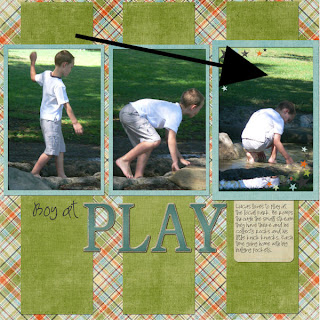
Scrapbook pages should be pleasing to the eye, drawing the attention through the layout. One way to achieve this, is to create flow on a layout using the photographs themselves. I created this layout using a series of photographs of my friends son playing at the local park.
 supplies: papers + journalling tab - shabby princess (wonderful kit); chipboard alpha
- Kim Hill CG essentials (recolored); font - SP wonderful wendy (scrapsupply.com)
- The vertical paper behind the photographs draws the attention to the photo's, whilst uniting the page elements and photo's
- Three 4x6 photo's placed in sequential order draw our eye across the page
- Note also how the subjects movement draws our eye across and down the page toward the title and journalling

- I find that using photographic flow for layouts works well with action shots such as these where the subject is constantly moving.
A simple page with standard 4x6 photo's can become something wonderful with directional flow through the layout. Try it yourself!
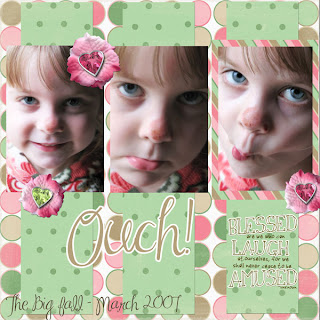
Here is a layout done with the digital template I provided for this sketch article! The details for which we included in Wednesdays newsletter, and in the newsletter for the EDS blog. 
Digital Layout by Krista Pearl
Credits: Vertical Mattes - Faith True, Green Dots, Faith, Hope, and Charity; Background - Faith True Circles, Faith, Hope, and Charity; Photo Matte - Faith True Stripes, Faith, Hope, and Charity; flower Petals - Traci Sims, Flower 1, Summer Lovin'; Flower Centers - Traci Sims, Gem 1 and Gem 3, Summer Lovin'; Edge Overlay - Linda Gil Billdal, Textured Edge 7, Textured Edge Overlays; Word Art - Vicki Stegall Designs, Blessed Shadow, 52 Inspirations Oscraps Week 10; Title font - MA Sexy by Margarete Antonio with stroke added;Template - Di Hickman, March-Flow (March Template 2)


3 comments:
Thanks for the wonderful tutorial on creating flow in layouts. Every little bit helps when you are trying to design & this definitely is more than a little bit. Again, Thanks!!
Nice article! Thanks so much for using my alpha on the first layout. I truly appreciate it. :)
coool article chicky!!!
Post a Comment