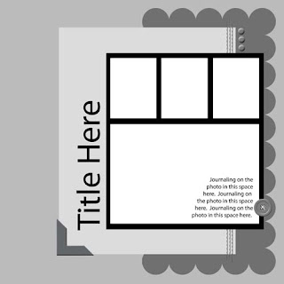
Tutorial - using layout sketches for cards
Tuesday, November 4, 2008
- Layout Sketch
- Pen & Paper or computer software


Supplies:
- Cardstock
- Patterned Paper
- Scallop template
- Ribbon
- Photo Corner
- Button
- Brads
- Stamps
- Ink
- Scissors
- Adhesives
- Cut cardstock to 8.5” x 5.5” score and fold for a card base.
- Cut white cardstock to 1” x 5.5” and adhere to card, adhere ribbon to white cardstock
- Trace scallop with template and trim with scissors, embellish with 3 brads in top right and adhere to card base.
- Cut blue cardstock to 3” x 2.5”, add photo corner to bottom left, stamp greeting and adhere to card base.
- Stamp flower onto white, cardstock, trim to 1.5” x 2”, mount onto blue cardstock and trim leaving a ¼” border. Stamp flower again onto green and blue cardstock, trim leaves from green cardstock and flower from blue cardstock and layer onto stamped panel.
- Embellish with button
- Stamp greeting onto panel in coordinating ink.
 Supply List: Cardstock: DCWV; Papers & Ribbon: Target; Stamps: Hero Arts, EK Success; Ink: Clearsnap; Photo corner: 3L; Brads: JoAnns; other: Button
 • Use coordinating papers from the same product line to add unity to a card
• Make a matching envelope.
More tutorials soon!
Di


0 comments:
Post a Comment